RSS

Monthly Archives: October 2011

Well Designed Sites

Melanie Alban
http://syropia.net/ I think that this portfolio website has a really unique look to it. The colors are soft but there is still contrast. I think that the text that was used is bold and different compared to the usual text that is used on websites.  Also the combinations of different fonts keeps the look interesting.


http://www.orangeyouglad.com/ This website for a design studio in New York has a very soft color palette.  While many colors are used, the colors are soft and not over powering and I think that it makes it easy to look at while still grabbing your attention.  The fonts are bold and easy to read.  Over all, I think this design is very effective.

 
http://www.michaeljfox.org/ I think that this site for Parkinson’s research is very well designed.  From the layout, to the graphics, to the color palette, everything just works very well together.  The graphic used is large and really catches the users attention when they get to the main page.  The splash of orange really adds a pop of color to what could be a really dull looking website had they just used the grey, black, and white.

 
Leave a comment

Posted by on October 31, 2011 in web 1 blog


Three Well Designed Sites

CommonWealth Lacrosse– I like the design of this site because everything is easy to read and find. All the buttons leading you to the different equipment parts of the site are right at the top and very easily found. The blue and orange also work well together as they are complimentary colors and the grey and white background gives a subtle touch of seriousness.


EastBay Grille– This is a website for a restaurant near me at home. I like how everything is aligned in tables and it is all very easy to read. The navigation bar at the top of the page stands out against the white background for easy access. The light blue coloring that serves as a border and background gives the user a feeling of relaxation which goes with the restaurants ambiance because it is right on the water and beach.


Plimouth Plantation– This is the website for the Plimouth Plantation in Plymouth, Ma. I like the design of this because of the simplicity of it and again how easy it is to find what your looking for. I also like the little bits of video that play in the background so you know what you can expect when thinking about you visit to the plantation. I also like how they use red as the background for the search bars because as the color theory reading said, it shows their passion for what they do.

 
Leave a comment

Posted by on October 31, 2011 in web 1 blog


Well Designed Websites

By billy thacker

Food Sense

The food sense website uses effective layout. All of the site’s features are visible and the viewer does not need to scroll down very far to see all the content. The page does not have glaring advertisements or other distracting factors. The page is simply designed because all of the elements line up without appearing too boxy and appear clean against the white background. Also, the thumbnails on the left side of the page are both illustrative and attractive. The webpage uses an attractive central image which smoothly transitions from one picture to the next.

HBO

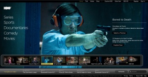
 The HBO website uses flash programing in a fun and non-overwhelming way. One can scroll through the shows and change the central graphic by navigating through the bottom menu. All of the sites features are available to the user without him or her needing to scroll down. Less important features are placed at the top and bottom of the page but still do not fade from the user’s awareness.
Hungarian Wine Society

  This Website has a strong color scheme that is unified within the images and text. It uses several different fonts but still does not overwhelm the user. The scrolling shopping cart on the side is distracting and annoying, though.

 
1 Comment

Posted by on October 30, 2011 in web 1 blog


Three Well-Designed Websites

http://www.zumba.com/ I love the Zumba website!  It is so bright and fun and it conveys the energy of a Zumba dance-fitness class.  My favorite thing about the site is the use of color: the background is gray and almost every bright color is used: pink, purple, orange, yellow, green and blue.  All the colors together look awesome!

http://www.pinkberry.com/ I have always liked the Pinkberry website.  The white and gray palette is very clean and the pink and green are great accent colors.  The music on the homepage gets annoying after awhile but it’s kind of catchy and different at first because most websites don’t have music.

http://www.pitcherandpiano.com/ I think the Pitcher & Piano website is clean and pretty.  There is a lot of text and it is small, but I think it looks neat and organized, and the promotional banner at the top (currently advertising booking for Christmas) and the menus on the side draw more attention than the words.

 
1 Comment

Posted by on October 30, 2011 in web 1 blog


Well Designed Sites

by Erick Convery

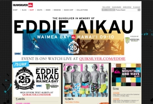
Quiksilver – I like this site because it extremely easy to navigate with the navigation bar at the top.  It is also very simply designed with the newest sale, event info and news being the only information provided on the page.  There is also very little scrolling necessary which makes it very compact.

Baxter – This is the site for the company my dad works for.  This site is very similar to the Quiksilver page in layout and is also very simple to navigate.  All information is easily accessible from the main page.  There is also very little scrolling necessary on this page.

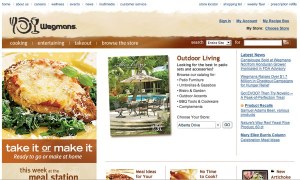
Wegmans – This is the site for a grocery store my mom frequents.  The site has a very simple layout as well with a number of simple photos with links, as well as a navigation bar.  All the text is large and easy to follow.  The simplistic approach makes the site easy to follow despite the need to do a little scrolling to cover the whole page.

 
Leave a comment

Posted by on October 30, 2011 in web 1 blog


3 Well Designed Websites

By Chris Cipriano

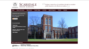
Scarsdale High School– This is the website for the high school I went to. I like it because it has easy navigation to get to all aspects of the website and it isn’t overwhelming to the viewer. Also the website is very compact and you’d don’t have to scroll.

Todaro Bros– This is the website for a store/small supermarket that is by my house. It’s a very simple design, but it works. This site also features easy and clear navigation on the top of the page. The rotating photos on the hompage adds a nice touch.

Bareburger– This is the website for a burger joint near where I live. I like it because there isn’t a lot of text to overwhelm the viewer, just one small paragraph. They did a good job with the color scheme that they used. Also the picture on the right provides a nice contrast.

 
Leave a comment

Posted by on October 30, 2011 in web 1 blog


Well Designed Sites

http://www.thinknoodles.com/menu.html   -While I was in New York during the summer it seemed like every restaurant had really interesting websites and Republic, a Thai noodle restaurant, was one of the many restaurants with a well designed website. The main page has effective coloring and a clean layout with organized photos.

http://magnoliabakery.com/home.php -Another company in New York that had a strong website was Mangolia Bakery.  This website also had a clean layout with an appropriate homey design to it as well as an effective use of colors to accent their cupcakes.

http://www.maxbrenner.com/ – Max Brenner, a restaurant famous for their chocolate desert, has a very unique website. The website is easy to use and the colors make customers crave chocolate.

Max Brenner

Max Brenner

 
Leave a comment

Posted by on October 29, 2011 in web 1 blog


Well Designed Sites

By: David Gerz

http://edensandavant.com/ Over the summer I worked with a commercial real estate company and I found myself coming back to this real estate company’s website for inspiration. I think it looks very nice graphically, it is very modern looking, and there is minimal scrolling. Also, all the information is easily accessible.

http://preit.com/ This is another website I visited a lot over the summer. It is a little bit more cluttered than the first site; however, I think that the colors in the site and overall design is very effective. Even though there is more going on compared to the first site, it is still easy to navigate which is good.

http://www.pennsquaregrille.com This is a local restaurant back home. The website is very neat and clean. It has a very modern feel to it. Also, everything is easily found and the layout is very intuitive. I also like that everything is graphic/photo based. I feel like graphics and photographs are able to help tell things about a place that words can’t, and they are also able to free up clutter on a website.

 
Leave a comment

Posted by on October 29, 2011 in web 1 blog


3 Well Designed, Small Websites

By: Megan Stanton

When trying to find good examples of small websites, I googled little shops from my hometown and near-by towns that I like to go to.  The following are three examples of what I think are good websites for small businesses:

Severino Pasta

This is my favorite of the three sites.  I really like how the theme and color scheme of this website seems sophisticated.  The colors match with the store’s logo and the red and tan colors go well together.  The site has good organization and the navigation bar is simple to use.  I like the design used in the navigation bar to indicate which page you are on.  Lastly, I like how all of the main images are in black and white, it helps carry a consistent theme throughout all pages of the website.

Kiwi Yogurt

I chose this website because I think it does a good job of capturing the feel and atmosphere of the actual store.  The website gives off a fun and colorful feeling which is exactly how the store is.  I liked creativity used in the navigation bar, incorporating some of the toppings available at the store in pictures above the navigation links.  This site is also very consistent from page to page.  The logo is always located in the top left corner, with three colored bars underneath with the words “fresh, flavorful, and fun”.

The Paper Trail

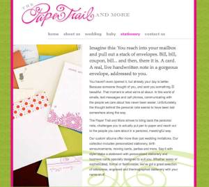
Lastly, I chose this website because of its simple design.  The website is easy to navigate and therefore user friendly.  I think that this website has a good balance between text and images.  Also, I think that the color scheme works with the type of store that this website is for.  I like how the green background is not just solid, but it has a subtle pattern.

 
Leave a comment

Posted by on October 27, 2011 in web 1 blog


Websites for project

http://www.sweetbakerybaltimore.com/ – This is a link to Sweet Bakery in Baltimore. I this the color scheme of this website. I also like the way that the site is set up and organized.

http://www.billysbakerynyc.com/ – This is a link to Billys Bakery in New York City. The colors of this site are very simple but work well. I like how it displays the pictures of the products.

http://www.cinderellacakes.com/ – This is a link to Cinderella Cakes. I like how the pictures change on the main page. It also has bakery updates for the customers.

http://www.farinellabakery.com/ – This is a link to Farinella Bakery in New York. The theme and layout of this website is simple but easy for customers to navigate.

 
Leave a comment

Posted by on October 26, 2011 in web 1 blog